Tuesday, December 28, 2010

Job Growth and the Recovery

David Leonardt in the New York Times has a great chart breaking down the job growth in 2010 and what that means for the shape and duration of the recovery. The general picture is not new, but the way it is described is quite useful and insightful.


Commodity Prices and Core Inflation

Paul Krugman has a good chart showing the relationship between commodity prices and the CPI - basically that commodity prices fluctuate greatly but the CPI has stayed the same - and how calls of hyperinflation seem overblown (at least for the foreseeable future)


Saturday, December 18, 2010

Effect of Macroeconomic Policy

This chart from Brad DeLong's blog is a good visual of the effect of macroeconomic policy on macroeconomic stability.


The Winner is Germany

An article in the New York Times makes clear how much Germany, compared to other eurozone members, has gained in growing exports since the creation of the euro. As the chart below shows, Germany has gained at all levels - and might gain more as the euro falls in value.

Monday, December 13, 2010

African Cities

The Economist has a good graphic on the growth and size of African cities. The graphic can dispel the American image of Africa as a place of rural villages. This realization might impact what Americans might think of Africa and how to help it.

Euro Bond Graphics

Throughout the whole eurozone crisis, there has been the talk of setting up euro bonds. The idea is that instead of each euro country issuing bonds based on their individual credit, they could borrow based on the credit of the entire euro zone. This would allow the smaller poorer countries to benefit from Germany's lower rates. Since it is now clear, after Greece and Ireland, that the eurozone will bail out countries at risk of default, this idea is seeming more credible than it did a few months ago. The German magazine Spiegel posted this good graphic describing how this would work:

Sunday, December 12, 2010

Trading Derivatives - Old Way and Clearinghouses

The New York Times has a good article about how the big banks are setting the rules for establishing the clearinghouses that trade derivatives. The article is actually a good example of the potential social costs from markets in which some parties have lots of market power (oligopoly and monopoly) and how they can capture profits by controlling entry to the market and making prices non-transparent.


The article also has a good supporting graphic that shows how the old system for derivatives worked compared to how the new market should work. A good teaching tool. Here it is:


The New Tax Plan and Multiplier Effect

Mark Zandi on Moody's/Dismal Scientist makes his forecast as to how the Obama/Republican Tax Deal will affect the economy - overall positive, but at a cost. In his forecast he has two interesting charts. The first is the multiplier effects of different parts of the plan. This chart could be an interesting teaching tool to show how different types of programs have different multipliers:


The second chart is the long-term forecast of the economy over the next several years and how the tax cut will effect both short and long term economic plans:


Friday, December 3, 2010

New Unemployment Numbers - Bad

The unemployment numbers for November are out - and things look worse. The new unemployment rate is at 9.8%. This seems to be darkening the thoughts that the recovery was starting to gain steam. The bleakness of the jobs picture is shown in this graph from the New York Times:

Tuesday, November 30, 2010

Spreading Euro Crisis


Poor Europe. No matter what it does, the crisis is spreading. The German news magazine Spiegal has been covering the crisis and has another good graphic of the countries in trouble. Here it is:


Serious Macromodel with explanation

Most models used in intro classes are basic and do not really convey the sophistication of economic modeling. In today's Wall Street Journal, there was a good article on agent based modeling that had the following image that showed a macro-model and provided a good explanation - which even a intro student could understand. I will be using this as a prop for showing students higher level modeling.


Sunday, November 28, 2010

Mapping America

The American Human Development Project has a great web page called "Mapping the Measure of America". It is a huge database of social science statistice built into an interactive map of the United States for comparisions across the country. Check it out...

Brad DeLong on the failure of macro

Brad DeLong has published a very readable essay called "Battered and Beaten" on the current crisis and the failure of policy to address the crisis. Another good DeLong post is "The Four Horsement of the Teapocalypse". Krugman has built on to this with his own thoughts on the intellectual and poltical failures of policy in a post called "The Instability of Moderation".

Saturday, November 20, 2010

Deflation, Fed Policy and Exchange Rates

The big story has been Ben Bernanke going to bat for Fed policy against both domestic and international critics over QE2. Domestically, the big fear is inflation. But the new inflation numbers (core CPI) show that inflation is at historic lows and going lower. The fear is that the United States is following Japan in into its own lost decade. The chart below from the New York Times shows this clearly.


China has made it clear that it opposes QE2 because it will lower the value of the dollar, which will make it harder for China to maintain its huge trade surplus. In response to QE2, the Chinese Central Bank has raised its reserve requirements by half a percent (the Chinese Central Bank uses the reserves to buy dollars) which will negate the affect of QE2 plan. This is described in a good article in the New York Times. Here is an example of banking policy affecting exchange rates.

Wednesday, November 17, 2010

Krugman with the Snow

Paul Krugman has a post where he makes a good use of the Swan diagram to explain how the trade issues between the United States and China affect both economies, and how they could solve each others problems (if China would let them). Here is the diagram. It is a good teaching tool - I wonder why more textbooks do not use it. here is the Wikipedia link with more about the Swan diagram.


Irish Crisis - Good Graphs

The German on-line magazine Spiegel has a series of good charts showing the problems in Ireland and comparing the Irish situation to the rest of the euro-zone. Here is the interesting part - clearly Ireland is in trouble with high unemployment and a very high deficit (30% of GDP), but its overall debt to GDP is low (lower than Germany's). So, why is this a sudden crisis? Why is there a sudden jump in Irish interest rates?
Look at the charts:


Sunday, November 14, 2010

The New Age of Austerity

The New Age of Austerity is the phrase in today's article in The New York Times, by David Leonhardt, on the difficulty the United States will have in reducing the long-term debt problems it is facing. The root question is how much of tax increases and spending cuts can be done while keeping the economy growing and not having an adverse decline in government services. Basically, there are no painless choices, but there are less painful choices. And while everyone has to feel some of the pain, who should feel more and who should feel less is a hard political choice.

The times also has a great interactive budget puzzle, where the reader gets a change to put their own budget priorities to the test. Good luck.

Wednesday, November 10, 2010

American Debt and Deleveraging

The amount of household debt, and the process of deleveraging, is an important part of the economic recovery. The fact that American households are trying to repair their balance sheets from the combined problem of running up large debts during the 2000's and suffering from the large negative wealth effect as a result of the housing crisis and declines in the stock market, is a major factor. So, how have American households been doing in this recession and how much more debt deleveraging still needs to happen, are the big questions. The chart below, originally from the New York Fed, but reposted on the Economist's Free Exchange Blog, shows the rise in household debt and how it is slowing be cut down - still a long way to go.

Ireland's growing deficit - and crisis

Last spring Ireland was held up as the model of what countries should be doing - engaging in an austerity package in the face of a deep recession. They were doing this to stay within the bounds of the euro-zone treaties that limit deficits and debt. It was clear that the budget cuts and tax increases would be painful. Still, it was seen as the responsible thing to do. During the Greek crisis last spring, the Greeks were constantly reminded that the Irish were doing the noble thing. Even more oddly, given the current state of things, some people said that austerity would cause economic growth.

Now, it looks like Ireland will be the next point of the euro-crisis. The Irish deficit has been sky-rocketing and this has been compounded by rising interest rates. Clearly, Ireland is in trouble. Two charts from the Wall Street Journal get to the crisis. The first shows the history of the banking crisis in Ireland - it may be, as Simon Johnson has said, that Ireland's banks are "too big to save" (as opposed to the American banks which are said to be "too big to fail". The second chart shows Irish deficit compared to the rest of the euro-zone average.


This is about to get ugly.

Monday, November 8, 2010

Rewards of Austerity

Fiscal austerity is the big focus now. The basic idea is that the cost of rising national debts are too much and that nations, in the heart of a global recession, need to cut government spending. The big examples of this have been in Europe - namely the PIIGS (Portugal, Italy, Ireland, Greece and Spain). Last spring, when the focus was Greece, Ireland was held up as a model of fiscal austerity and prudence since it had cut its government spending in the face of recession. Of course the result of such a choice is to further weaken the economy - which is the case with Ireland. However, the reward for such behavior has been higher (not lower) interest rates. Check out the chart below from the German magazine Spiegel. Clearly, the bond markets don't care about austerity. They care about the ability to repay debt - which increases as an economy gets stronger.

Sunday, November 7, 2010

Intelligence and Economics

The Freakonomics blog has a post on the relationship between intelligence and economics. The basic point is that more intelligent people tend to think like economists. It is not just that more educated people think like economists, it is that education is a "proxy" for intelligence.

Saturday, November 6, 2010

Time Span to Close the Unemployment Gap

The new unemployment numbers are in - and the overall picture has not changed much. Unemployment is still at 9.6% and underemployment is at 17%. While the economy added jobs, it did not do enough to close the gap between its current state and full employment. For that we need more growth, and more jobs. The hard part, beyond the current numbers, is how long it will take the economy to get back to full employment. The Brookings Institution has a good report on the effects of long-term unemployment, which contained this graph showing how long it would take the economy to return to full employment based on the number of jobs created every month. For reference, only 151,000 Jobs were created in October (its not even on the chart!).


Wednesday, November 3, 2010

Timeline of Fed Policy

With the news of today's FOMC meeting and the decision to engage in a $600 billion Quantitative Easing program, it seems like the Fed is reaching deep into its bag of tricks to get the economy moving. However, despite the size of the action, it is really unknown (and unclear) if this will have much effect. But, it seems on balance to be better than doing nothing (which is what fiscal policy is doing).

The New York Times has posted a graphic timeline of Fed policy in this crisis. It is a good teaching tool.

Saturday, October 30, 2010

Dim expectations for the QE2

Paul Krugman has been looking at Japan and its lost decade for guide as to what the next round of Fed Quantitative Easing might look like. In a recent blog post he looked at how much effect the Central Bank of Japan's policy of quantitative had on the Japanese money supply. The evidence says it has almost no effect. Here is the graph to support this:


Krugman's explanation for this was that when an economy is up against the zero bound, monetary policy ceases to have any effect. Sounds familiar?

Microscopic Microeconomics - Psych & Econ

The New York Times has a short piece called Microscopic Microeconomics on the brain science behind economic decision making - particularly in regard to investment decisions and speculative bubbles. While there are a lot of sources of this information out there, this is a nice short piece that goes into the brain science behind behavioral economics.

Sunday, October 24, 2010

Long Term Unemployment on 60 Minutes

60 minutes had a good piece tonight on the effects of long term unemployment in Silicon Valley. The piece specifically looked at the troubles that educated older workers are facing in this recession. Here is the link.

The PBS program Need To Know had a piece a few weeks ago that looked at the same problem, except this time the focus was on people who were not professionals, but in much the same situation - only worse - called "The New Poor".

Retirement Ages - International Comparison

So, the French are protesting the plan by their government to push up the retirement age from age 60 to 62. This is part of a larger political battle about bringing European government budgets into compliance with the Euro zone rules. The chart below from the German magazine Speigel shows just how young the French retirement age is when compared to other major industrialized countries.


It is interesting to compare actually retirement ages to official statistics. Also, check out the gender differences in the official ages in every country except the United States.


Saturday, October 23, 2010

Who might vote for QE2 and what to expect

The blog Calculated Risk has posted a chart showing which members of the FOMC it expects to vote for the second round of Quantitative Easing or QE2. According to the chart, it looks like it will happen. Paul Krugman has a description of QE2 that puts the policy action in perspective and is not too optimistic.

Friday, October 22, 2010

Growing Income Inequality

The issue of growing income inequality has been an issue in the United States for several decades now and there are many reasons for it ranging from structural changes in the economy to the reductions in many government programs. This is a good chart showing this change over time, from the Economist View blog.

Saturday, October 16, 2010

Size and Scale of the Mortgage Mess

The current foreclosure nightmare is big and it is far from clear how it will be resolved. Many in the finance industry and government claim that the halt of foreclosures will be over soon and things will keep moving. It would be nice to believe this, but we have heard this type of talk before. The bigger issue is that the American economy is far from being out of the woods with this housing crisis. This graphic from the Wall Street Journal shows the current size and scope of the problem.


Thursday, October 14, 2010

Brad DeLong's confused students

Surprisingly, one of the trickiest parts of teaching economics is to get students to understand how a market works and that the price adjusts forces of supply and demand to equilibrium. It seems easy enough, and most students learn how to demonstrate this mathematically and graphically. However, students often fail to grasp the real reason that economists like markets - that the price works as a signal that allows market participants to self organize a solution to unexpected changes in the economy. Somehow, students believe there is some magical third force guides the economy. Maybe this is a result of so many tellings of Adam Smith's "Invisible Hand".

If you feel like you do not do a good job conveying this idea to your students, you are not alone. Brad DeLong blogs that he has the same problem. Read his post and take heart.

Wednesday, October 13, 2010

Economic Recovery and Growth

The New York Times has a good graph (shown below) of how far the economy is below the baseline of potential GDP and how long it will take the economy to get back to potential GDP under different growth rates. Dismal science once again.

Tuesday, October 12, 2010

Nobel Prize Winners!!!

The announcement has come out for this year's Nobel Prize in economics. There were three winners, with Peter Diamond of MIT, at the forefront of the trio for his work on search theory and the workings of markets. Two good descriptions are the PBS News Hour video and Paul Krugman's connection to Diamond's work on Search Theory and the Beveridge Curve.

Saturday, October 9, 2010

Foreclosure and Property Rights

The housing crisis and financial crisis has had a huge effect on my economics classes. Formerly obscure concepts, such as credit default swaps, and mundane points, such as the limits of Fed power, have come to the forefront as important issues that students need to know to fully understand the crisis.

The foreclosure problem is quickly turning into a new teachable moment on the importance of property rights. Quite simply, the announcements by major banks to suspend foreclosures across the country due to problems with the paperwork (due to missing and fraudulent documents) has the potential to cloud the property rights to foreclosed houses across the country. While the legal issues involved are interesting and maddening, from an economics point of view, the confusion over property rights will make it harder for the housing market to function and recover from the crisis. Simply put, who will buy a foreclosed house when the title to it is suspect (title insurance companies are pulling back from issuing new policies on foreclosed properties).

Any solution to this problem will create more problems. If people fighting foreclosure can win either monetary payments from banks not to fight or possibly win title, and lose the mortgage obligations in the in the process because the banks cannot show ownership, than the result is moral hazard to default and more people will challenge the banks. This will have the knock on effect of further weakening the financial positions (and stock values) of the banks. Ignoring the problems with these mortgages will make it easier to foreclose (which has been tried in some states such as Florida), will result in more abuses by banks, such as foreclosing on people who never had a mortgage with the banks. This new part of the crisis stems from attempts to speed up the process, which brought the issue of bank abuse to the light of day.

There is no good solution to this problem. However, there is a good teachable moment.

The core of the teachable moment is this: basic economics teaches that secure property rights are crucial to the functioning of any market. The failure of property rights will cause market failure - in this case, it will prevent the recovery of the housing market. Only governments can enforce property rights.

A good description of how this new part of the crisis has emerged is covered by Mike Konczal at the blog Rortybomb.

Wednesday, October 6, 2010

Great Graphic on the Output Gap

The Washington Post has a great interactive graphic on the output gap and what it would take to close it. This is why they call economics the "dismal science".

Great Graphic on Global Trade

The German on-line magazine Spiegel has a great graphic showing the imbalance of trade between China and the United States and Europe. Check it out:


Tuesday, October 5, 2010

Can you say "public good"

Market failure and the need for the government to provide public goods is a core lesson in economics. Simply put, the private market will not provide some things at a socially optimal level because of the free rider problem. Examples of this are military protection, police, and (yes) fire protection. If you ever needed an example of this, the state of Tennessee has provided a great example that clearly shows the reason. In a rural area of the state the fire protection is provided on a fee based system of $75 a year. In one case, the fire department let a family's house burn down because they did not pay the fee - even though they easily could have saved the house - also the family was willing to pay. Here is the link.

Sunday, October 3, 2010

Bits and pieces

School has been busy lately and the economics news has been in rolling forward. There are a number of interesting pieces out there that could be really useful for teaching. For example, in today's New York Times, Robert Shiller has a column on the larger effect of unemployment on the employed called "Survival of the Safest", which has a lot of good insights about unemployment. One, that has real applications to teaching macroeconomics is an explanation of sticky wages (even though he does not use that term) in a recession.

The New York Times also has a great graphic showing the the TARP repayment. It shows that while some parts of the program have profited, most parts of the program have not (should that really be a surprise?). Gretchen Morganson follows that up with a column about why we should expect more TARP like programs in the future because the Dodd-Frank financial legislation set up more backstops for the financial industry and created more moral hazard opportunities by enlarging the potential firms that could be considered "too big to fail".

Paul Krugman has a good insight about how people view markets as morality good, and how that view is utterly wrong in this blog post called "Economics is not a Morality Play". This is an important point students need to understand. Economists do not like markets because markets are virtuous - any they are not. Economists like markets, when they work well, because they work to efficiently distribute resources to best meet needs. When markets do not work, economist think about how to use other tools to efficiently distribute resources to meet needs. That might mean changing markets with regulation or outright government action to deal with "market failure" through the provision of public goods.

Monday, September 20, 2010

Has the crisis changed economics?

The Economist has a by invitation discussion this week on how the economic crisis has changed economics, and by way the teaching of economics. It should be a good read.

Friday, September 17, 2010

US recession in international comparison

The New York Times posted the graphic below comparing the recession in the United States to other developed countries. The basic point is that the United States has not suffered as much as other countries - and has recovered more. Still, there is still a large part to cover to get back to where we were prior to the recession.

Thursday, September 16, 2010

Best economic minds are not so good?

Michael Hirsh in Newsweek has a piece on the the failure of economists to come to terms with the crisis. The article is a good summary of the arguments made in longer pieces by economists and other writers. This article would be a good primer to use with students to introduce them to the intellectual crisis in economics brought about by the crisis. More about what Hirsh is talking about can be found in these two Krugman pieces: "How did Economists Get it so Wrong" and "The Slump Goes On: Why?".

Poverty Rate is up - highest since 1994

The new poverty rate numbers are out - and the news is bleak. While the unemployment numbers are depressing, the poverty numbers show the real brutal reality of this recession. The hard truth, 14.3% of the the America population is living under the poverty line. That is one in seven people. For children, one in five live in poverty. The time in poverty will scar people's lives for years. Keep in mind, these are the 2009 numbers. 2010 will most likely be worse. Here is the article from the New York Times. This is the graphic to go with it:

Wednesday, September 15, 2010

Fiscal Times

As a teacher, I am always on the lookout for a good source for thoughtful articles for my students. From Mark Thoma's blog, I just learned about a new on-line journal "The Fiscal Times". It looks pretty good and balanced, with a wide range of articles.

Check it out.

Why businesses are not hiring - AD

The chart below was from Paul Krugman's blog (he got it from Catherine Rampell) and it shows the reason what business say it the most important problem - looking back decades. Quiet simply it shows that the most pressing problem is the lack of sales (read lack of demand - not taxes or government policy).


Sunday, September 12, 2010

Long Time Away

The start of the school year has been very busy and has kept me away from posting. Here are two articles that might be good to use in class. The first is from the Economic View column in the New York Times where Robert Frank discusses the role of infrastructure spending in the United States with a comparison to other countries. The basic point is our infrastructure has deteriorated and needs repair and right now might be the cheapest time to do this - not to mention, over the past few decades we have spend too little to make the improvements. The acticle does a good job with showing how the con opportunity cost affects government policy.

The second piece is by Paul Krugman and Robin Wells called, "The Slump Goes One: Why?" from the New York Review of Books. Pretty self explanatory in what it is covering.

Saturday, September 4, 2010

Interactive historical unemployment graphic

The Wall Street Journal has a great interactive graphic showing the historical unemployment rate in the United States. The graphic provides an interesting way to look at severity of recessions and puts the current crisis in context.

Wednesday, September 1, 2010

Unemployment & Inflation - This time is different, not so much

Paul Krugman has good post on how high unemployment is affecting inflation unemployment in the way the Phillips curve would predict (he also has a good chart comparing this recession to earlier ones in regards to inflation and unemployment). He also notes alarm that the Fed seems to be ignoring this piece of economic theory.

Saturday, August 28, 2010

Looking behind statistics

The skill of looking at statistics is a learned skill. Too often, people just take the numbers as is without trying to think deeper about what the statistics are telling them. The Economix blog on the New York Times posted the stats on marriage from the Census and how the different rates break down. A good exercise would be to have students look at the statistics try to figure out why they are the way they are. For example, why to people get married at different ages in different parts of the country.

Marriages, births & divorces all down

It seems that the recession is being reflected in the demography of the United States. In 2009, the number of new marriages, births and divorces all went down. The New York Times Economix blog has a good write up on this and the stats.

The decline of marriages and births are generally happy events, and the decline represents young people postponing these big mile stones by a year or two, when hopefully economic conditions improve.

But what about divorce? An earlier Economix blog post noted that financial stress increased divorce. Basically, that couples that fought a least once a week about money were 30% more likely to get divorced. With the recession and all the financial stress this involves, there should be an increase in the divorce rate. And most likely there will be... when the economy improves and couples can afford to get divorced. Or on a more hopeful note, the improving economy will help mend these damaged marriages (in that case, the recession might have silver lining).

How bad is housing? The worst.

The new existing home sale numbers were the worst...ever. Check out the chart below, it gives an indication of how far the housing market has fallen and how far it needs to come back to recover. Keep in mind that the tax breaks had the effect of getting potential buyers to "move forward" their date of purchase. That implies that the next few months (year) could continue to be bleak.


Friday, August 27, 2010

Mortgage Origination and the Housing Bubble

This is a good chart showing the types of mortgages (origination) during the housing bubble. It just shows percentages, so it does not give an idea of the changes in the net amount of mortgages during this period (which was also increasing and then crashing down). However, it does give an idea of how the bubble was expanded with riskier mortgages.


Wednesday, August 25, 2010

Policy makers and intro economics

Narayana Kocherlakota, the president of the Minneapolis Fed recently gave a speech saying that if the Fed keeps interest rates too low for too long it risks creating deflation. This statement has received a great deal of attention. The best blog on it, cited by both Krugman and Free Exchange blog on the Economist web page is Worthwhile Canadian Exchange that remarks "everyone should be forced to take Intro Economics".

Tuesday, August 24, 2010

New Federal Reserve Web Page

The Federal Reserve has updated and improved its education web page so that in links to all of the educational materials on the twelve different regional banks web pages. Here is the link: federalreserveeducation.org

Tragedy of the commons and space junk

Tragedy of the commons is a standard case for market failure. In the absence of property rights a resource will be over used and degraded. This is the core concept in environmental economics and economists have come up with all types of solution to this, including the program of "cap and trade" for carbon emissions (this is politically controversial, but pretty standard in economic theory). Here is a new example, that my really work with students who love their cell phones and the Internet). Space junk. The Free Exchange blog on the Economist web page has a great post about how space is a common resource and is becoming polluted with space junk. The problem is that too much space junk will ruin satellites that we have become dependent on for every part of modern life. Yet, because there is no incentive, nobody is seeking to protect this resource.

Sunday, August 22, 2010

Hidden cost of low interest rates

Opportunity cost is the core of economic thinking. The tricky part of economics is trying to see all the possible alternatives and assess the costs and benefits of these alternatives. The current interest rate policy being pursued by the Fed is a good example of this. The extremely low rates of 0-.25% for Fed Funds is good for banks and those managing large debts that have adjustable rates, but is really bad for savers and people living on fixed incomes. The fact that this policy has been in place for several years and could continue for a long time is affecting people's investment decisions by encouraging people to invest in riskier assets. Gretchen Morgenson has a good column in today's New York Times about the effects of low interest rates and the hidden costs. While she does not make a good argument for raising rates, she does point out the costs that many people are currently ignoring.

Friday, August 20, 2010

Bleak view from abroad

The German magazine Spiegel online has a bleak view of the current American economy. While bleak views are not anything new and are hardly unique these days, the article and images are good because it gives an insight into how Europeans are viewing the current crisis.

Is efficiency a goal in itself?

Uwe Reinhardt has a good post in today's Economix blog about how economists view efficiency and whether that is a good thing. He does a good job explaining Pareto and resource allocation. He also does a good job at pointing out the weakness of this view and how it applies to current economic issues in which free market policies are pushed by economists because of the claim of efficiency - such as immigration and growing economic inequality. In my opinion, it is a good piece for students to read.

Monday, August 16, 2010

Two graphs to show depth of recession

How far have we fallen in this recession and how far do we need to grow to regain what we have lost? The reality is that the recovery will not feel like a recovery until we start closing the gap between potential and actual GDP - growth by itself is not enough because so much has been lost. These two graphs struck me as indications of the size of the loss.


The graph of the left shows the decline in retail sales. The one of the right shows net worth. The story it shows is connected to the negative wealth effect that is weighing down consumer spending. Basically, consumption has and will continue to be low because households are significantly poorer than they were prior to the crisis.

Getting up to speed on the crisis

Since the beginning of the economic crisis, the challenge with starting an economics course is getting the students up to speed with what has happened in the crisis. In contrast to the teaching before the crisis, students now come in on the first day with lots of questions about what is happening and what will be happening in the economy. The two problems with answering student's questions is that what is happening in the economy is really complex and nobody has a firm grasp on where the economy is going. This second part is largely because the focus and points of worry are changing so completely and so quickly. Think about it. Right now the big point of focus in deflation. Three months ago is was Greece. The history of this crisis is a whirlwind tour of economics.

As I begin to plan for the beginning of another school year, I am looking for articles that can get students up to speed on the current state of the economy. I do not want a big article that tries to cover everything (that is where books come in). Instead, I want an article that has the "signposts" of things students should be aware of and gives them an idea of where the economy is at and the big events that got it there. Today's news analysis in the New York Times by Floyd Norris does a good job of accomplishing this task - short and to the point. Something the students can read in a few minutes and then I can use a class period to take apart and explain.

Sunday, August 15, 2010

Hidden Cost of Parking

Most of my economics students are in the process of getting, or have just obtained, their drivers licence. This pass to freedom is among their most cherished rites of passage. For high school students it is a big event to drive to school, as opposed to riding the bus or getting a ride with somebody else.

Many students quickly realize that the freedom of driving is hardly free. There is the large costs of gas, insurance and repairs.

On a side note, it is often sad to see how much time students spend working to pay for their cars. They often spend too much time working jobs, and not enough on school or sports.

However, one cost they do not think about is parking. The school I teach at provides free parking to students. Tyler Cowen in the Economics View column in the New York Times explores the real cost of parking and how there are many market distortions in parking. He notes how these distortions work as a subsidy meaning that the reality of free parking causes people to drive too much. It is a great little piece and I will be using it with my students this fall. It will be interesting to hear how they respond to something that cuts so close to their new found freedom.

Saturday, August 7, 2010

Color Photos of Depression

While this is an economics blog and not a history blog, the two are not exclusive. Example, teaching about the Great Depression (which gets a lot of notice these days). The Denver Post has a good collection of color photos from the Depression. They really make the period come alive. While the images themselves may not have the same feeling of desperation as the more iconic pictures, the details in the color photos are amazing. Also, a key point to remember about the Depressions is that, like now, not everyone was in a soup line or living in a Hooverville.

Recession and Long Term Growth

Edmund Phelps has a good piece in today's New York Times about the need for thinking about long term structural issues in the face of the current recession. His point is that we should not think about the current recession as a problem of insufficient demand, but as a result of weak growth due to poor business investment. He sees a good recovery will only happen if there is a return to innovative growth. Interestingly enough, he also sees the need to create more low wage jobs to help the whole society enjoy the benefits of economic growth.

Two points on his ideas:

First, he tries to differentiate his ideas from those calling for more stimulus to increase demand. By this, I think he means Krugman and others. However, I do not see why the economic choices offered by Pheleps and those of Krugman have to be an "either .. or" choice. Why not both?

Second, he focuses on funding innovation and tax cuts for hiring low income workers. Good ideas, but do good innovative business ideas really need special support? Why not support education, which is most likely to create innovative ideas in the first place?

Friday, August 6, 2010

Public savings and private costs

The New York Times has a good article about cities going to extremes due to budget problems and scrapping entire services (such as buses) and cutting the school calendar. These types of stories are common these days. The good part of this article shows how the public savings were forcing individuals to pay higher private expenses. In the article, it is mostly less affluent people who are hurt. However, it does not take long to figure out that this higher cost should also affect wealthier groups.

There is a lot of talk about how consumers need to start spending to revive the economy, and that the root to this is raising consumer confidence. However, if services that people depend on are being cut, or are under threat of being cut, and the alternatives are potentially expensive, why would people choose to spend current income instead of saving it for unknown expenses. This is a big issue and a key part of consumer uncertainty.

You wonder how many people would be willing to pay higher taxes to get their services back.

Health Care: Positive and Normative Economics

The terms normative and positive economics are part of any introductory unit in economics, but usually they are not covered beyond that point. They are important concepts because they speak to the limits of economic decision making before it bleeds into areas of morals and values (which many economist seek to stay clear). I must confess that I seldom bring up the terms after the intro unit (I would further say, these concepts are not a significant part of my intro unit).

I think this needs to change. Doing more with the concepts of positive and normative economics is something I have been trying to work more in to my course. I have come to the conclusion that economics, and economists, would be better served if they were more clear about when they have crossed from positive economic statements based on models and statistics and into the normative world of values. Such a practice would also help clarify things for the public. However, I do not see this happening since making a argument based on normative economics seems weaker than one made on positive economics.

Because of my goal of bringing normative and positive economics into my course, I was happy to see Uwe Reinhardt's post "Is Health Care Special?" on today's Economix blog. The focus of the post is the health care market should function like any other market - basically, is health care like houses. However, this post is the first in a series. Still, it is good potential reading on normative and positive economics which ties it to other aspects of economics (particularly the work of Kenneth Arrow). The post describes how Arrow viewed the market for health care in the terms of perfect competition and Pareto optimality. I hope the second part is just as good, since it could be a good reading for reintroducing the concepts of normative and positive economics into the unit on market failure.

Tuesday, August 3, 2010

Sound of one hand clapping and the tax debate

Maxine Udall has a great post about road quality as a statement about the nature of our economy. She bases her post on an article from the Wall Street Journal about how in the Mid-west some paved roads are being converted back to gravel because the local government does not want to pay to maintain the roads. She expands on this to note how a viable road network is crucial to a strong economy and how the United States has been letting is road network deteriorate over the past few decades.

However, the focus of her post is a quote from a person living on a paved road that has been converted back to gravel, "I'd rather my kids drive on a gravel road than stick them with a big tax bill." Udall notes that poor roads might mean his kids having less income (fewer job opportunities) or somebody dying because the ambulance cannot make it to the hospital). Faced with the loss of these benefits, his children might prefer having a high tax bill to keep the benefits of a paved road.

The core of Udall's post is that the debate over taxes often focuses on the cost of the bill, paid individually, and not the collective benefits society gets from better public goods. For her, the whole tax debate is the "one hand clapping". Too much attention is focused on the cost (taxes in the future) and too little on the benefits forgone by not getting better public goods (again potential benefits in the future).

The only addition I would make is that often the total benefits of the public goods are undervalued. At the extreme are the cases of the Egyptian Pyramids or the Great Wall of China. These are both examples of public goods which have produced benefits far in excess of their costs (yes, I know people died building these structures and I am placing a value on their lives and the benefits produced now is revenue from tourism, which is quite different from the original intention of the builders, but these are still benefits). Basic point, on a cost-benefit analysis, both of these were great uses of taxes.

Saturday, July 31, 2010

The Worst Recession

Yesterday's GDP numbers were weak. In the second quarter, the economy grew at a 2.4% annual rate. While normally a good rate of growth, this is bad for coming out of a recession - when growth has to be much higher in order to re-employ all of the people who lost their jobs. The key point is that we still need to close the output gap between actual and potential GDP. While growth is good, it is better for the growth to be appropriate to the economy's (society's) needs.

The bigger point, and one that needs to be pointed out to students, is that the economy has lost a lot of ground in this last recession and the output gap is huge. The Free Exchange blog on the Economist web page has a post and graphs that compare the change in output from this recession to all of the other post-war recessions - this is the worst. Again, this is a good graph for making students think. Here is the graph:


Thursday, July 29, 2010

How valuable is kindergarden?

According to new studies, kindergarten is very valuable - at present value, an outstanding kindergarten teacher is worth $320,000. Wow. David Leonhardt sums up this research showing the value of good teachers in a dollar amount. Interestingly, the real added value does not show up on test scores - which implies that there is something besides knowledge that teachers give their students that is of real value. Of course, that is what teachers have been saying for a long time. Now the numbers show it.

Unemployment Comparisions

How bad is the current employment situation. Krugman posted a set of charts on his blog that give a number of different ways to compare the current unemployment situation to past recessions - decline in employment, rate of unemployment and duration of unemployment. As could be expected, this recession is the worst is all categories. As a point of comparison, the second worst recent recession was in 1980 - with a large decline in employment and high unemployment, but the duration of unemployment was short.

I like these types of charts because the comparisons they make are great for class discussions.

Tuesday, July 27, 2010

More on Structural Unemployment

Mark Thoma's Economist's View blog has more of a break-down on the issue of rising NAIRU and its effect on macro policy - particularly, whether the Fed should be concerned with it. The idea for the Fed is that it could raise its inflation target rate to 4%, which would cause the economy to move up the Phillips Curve to a lower rate of unemployment.

Monday, July 26, 2010

Structural Unemployment & NAIRU

Defining and explaining unemployment is an important lesson in any economics class. A lot of time is spent on differentiating between the different types of unemployment and the solutions to them. A lot of the current focus in the news on unemployment is on the cyclical unemployment created by the recession, with some discussion about how many of the cyclically unemployed are actually shifting to become structurally unemployed. Usually, I use this as point for a discussion on the importance of education, and support for continuing education, so that the structurally unemployed can return to the work force, at a different job with their new skills.

However, there is a second discussion that I should be having with my students about how macroeconmoic policy can reduce the shift from cyclical to structural unemployment. This is one of those discussions that bring together a bunch of ideas from different parts of the course.

Reading today's posts on other blogs clued me into that discussion. The importance of structural unemployment is raised on the Economist "Economics by Invitation" blog (the answer by Mark Thoma is quiet good from the teaching perspective on the role of technology) and the point is followed up by a post on Krugman's blog, where he notes the increase in NAIRU (non-accelerating-inflation rate of unemployment). The problem is that this means higher permanent unemployment, even when the economy recovers.

The important point, and the one where it is crucial to remember the definitions of unemployment, is that structural unemployment will not be measured by the official unemployment numbers. Most people who are structurally unemployed will effectively drop out of the labor force (typically by claiming disability or "retiring").

The other important point here is the output gap, or the difference between potential and actually GDP. The measure of the output gap is an indication of the true depth of the recession since it shows the amount of GDP that could be produced from fully utilizing resources.

The output gap has been a way of noting the severity and length of the current crisis. Projections show that even when the economy is growing again (we are in recovery with growing GDP), it will be a long time until potential output is again equal to actual output. However, with higher structural unemployment, we may close the output gap faster, but be poorer for it. And be permanently poorer because of it.

One big factor in the shift form cyclical to structural unemployment is the length of unemployment. The longer a person is unemployed, the more their skill set declines and the less employable they become. So, the effect of increasing structural unemployment in this current recession is not just a factor technical change in the economy, it is also an effect of the severity of the recession. This is a place where stimulus employment may have a significant long-term effect to lower structural unemployment, hence make us all wealthier in the future.

Wednesday, July 21, 2010

More Signs of Deflation

Following up on my earlier post today about deflation, the blog Macro and Other Market Musings had a good graph on expectations of future inflation. Here it is:


The recent history shows a steady decline in long term inflation. The Free Exchange blog at the Economist noted how if it was in Congress, this would be the one thing it would ask Bernanke about.
As for his testimony, Bernanke saw unemployment staying high, above 7% until after 2012. The reaction, the stock market tanked.

Deflation: Then & Now

The Economix blog at the New York Times posted a chart and explanation comparing the rate of deflation now to 1929, at the start of the Great Depression. The chart is shown below:

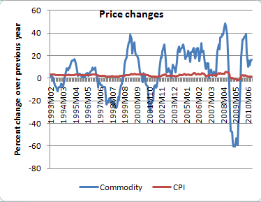
There are two points to note on the chart. First, it clearly shows the deflationary effects of the credit crisis - the rate of deflation was worse than that of the early Great Depression (that deflationary period set off a vicious cycle that led to later deflation). The second point is how, in the longer run, the more recent deflation problem has been relatively small - until recently. The big question is whether this recent downturn (last three months) will continue. The high level of unemployment and low consumer confidence are not encouraging.

From the perspective of teaching, I really like the chart above because of the comparison it sets up. My students are seniors, so they have had U.S. History and know about the Depression. A chart that sets up a comparison is good because it gets the students thinking about what might be different this time. While lots of things are different, the biggest difference is policy. The halt of deflation in the months after the credit crisis was the result of very active monetary and fiscal policy. The point of the chart it that it demonstrated that these policies worked - in the sense that they put off economic collapse.

A good question to ask students is how to use the information in the chart to forecast where the economy is going and what, if any, policy should be enacted. In other words, should the Fed be more aggressive in an easy money policy and should there be more fiscal stimulus, since both policies would be inflationary (or at least anti-deflationary). Getting students in the practice of forecasting and thinking about policy is getting them to do what economists do.

Tuesday, July 20, 2010

Whiteboard Videos

The current economic crisis has made teaching economics more difficult in many ways. Chiefly, there is the problem of how to explain the crisis to students who do not know much about economics or the economy (no surprise there). The problem of of teaching difficult and complex material is something that teachers are constantly dealing with. Consider the problem of teaching the Holocaust - not a simple task at all. Typically, teachers try to break it down into smaller parts that students can relate to and in terms they can understand.

However, one of the big problems with the current crisis is that the smaller parts fit together in complex ways and the basic terms are obscure. This is especially the case with the financial terms and concepts that are at the core of the crisis.

The radio program Marketplace has a good series of videos that deal with all aspects of the crisis. In the videos, Paddy Hirsh, the commentator, diagrams a concept or term and explains how it fits into the crisis. The videos are an ideal teaching tool because they are short (less than 10 minutes), simple and entertaining. This is a link for the videos. I recommend starting with the one comparing the economic crisis to an Antarctic expedition.

I have used these videos in my economics classes for the past year and my students love them. Typically, I assign them as homework (I have bandwidth issues at my school) and quiz the students to see if they have watched them. I have also used the model of the whiteboard video as a project for my class. I have my students pick a concept that the course has covered and make a short whiteboard video on the topic, which the whole class watches. The results have been very entertaining and lead to some good class discussions.

Monday, July 19, 2010

Unemployment, Housing & Confidence - When Good News?

Teaching students about the meaning of economic statistics is very important, and there are always news stories that help making these lessons in statistics current. In my economics classes I try to focus more on the forward looking statistics (leading indicators) rather than the lagging indicators. Unemployment and GDP numbers are classic lagging indicators that show where the economy has been, this is because they are calculated and posted for previous months or quarters. These statistics are important and good for gauging the economy, but provide little insight into the future.

Other, and more obscure, economic statistics are better at giving an idea of the future. Consumer confidence is the classic leading indicator. Since 70% of economic spending is consumer based, how consumers choose to spend their money is an important part of seeing where the economy is going. The Free Exchange blog, from the Economist Magazine, has a chart and description of the bleak consumer confidence numbers that came last Friday. That connected with the core inflation show that we are a long time from a recovery.

Other statistics that point to the lack of recovery are the newest housing numbers from the National Association of Home Builders from the Free Exchange blog, which shows the NAHB index going back down to the lows of the recession ( and is again below the lows of the 1991 recession).

If that is not enough, there is the graph on Free Exchange showing how long it will take to close the job (employment) gap by comparing the current level of joblessness to the history of the past few decades. As the post makes clear, it could be five years to a decade before this gap is fully closed. It adds in the thought that the economy may not reach full employment before the next recession.

Thursday, July 15, 2010

Interactive Graphs

Teaching economics means teaching graphs. More accurately, teaching economics involves teaching spacial thinking. The trick os to get students to be able to visualized the graphic models, or at least be able to visualize how changes might affect the graph. There are many ways to do this through lecturing or having students run through problem sets. The ideal would be to have graphs that move and are interactive. There are many sites that have interactive graphs to use in economics. Here are a two of the better ones.

Wolfram demonstrations has interactive graphs for high school economics (and loads of other subjects) that are available for download. These graphs are nice because the illustrate some of the more subtle concepts that are crucial to fully understanding a concept, such as the relationship between revenue and elasticity.

Think Economics has a good set of interactive graphs with explanations, policy prescriptions and some questions (in which the inactive part involves demonstrating the solution on the graph).

Saturday, July 10, 2010

Hand signals on the Chicago Exchange

When I teach about financial markets, I usually show part of the PBS Nova documentary The Trillion Dollar Bet about options (this was done about ten years ago and it describes the Black-Scholes formula for pricing financial options and meltdown of LTCM - because of the current economic crisis, this is a documentary that has actually become a more useful teaching tool over time). In it there are several great scenes of the Chicago Mercantile Exchange showing the floor traders flashing hand signals at each other to make their trades. Students always ask, "How do the signals work?" and "What do the signals mean?"

Now I have the definitive answer. Ryan Carlson, a former floor trader, has setup a web page with a history, images and explanations of the hand signals. I was clued into this by the Wall Street Journal article, "Trader Keeps Hand in History".

Cool.

Friday, July 9, 2010

1937 Again?

The debate for another or continuing fiscal stimulus has continued to be a Major point of debate in columns and blogs. The New Keynesian economists are making a big push for additional stimulus spending, or at least calling attention to the idea that they have most of the good arguments on their side, but are still losing the policy battle. Brad DeLong has an column in The Week called "Keynes and Co have lost the stimulus argument" in which he outlines this idea and explains the reasons he believes this to be happening. The Week also has a surprising column by Robert Shrum called "David Brooks' neo-Hooverite plea" in which he takes New York Times Columnist David Brooks to task for opposing Krugman arguments for more economic stimulus in his column piece called, "A Little Economic Realism". The back and forth of this argument is a good primer in the larger debate over austerity vs. stimulus. If school was in session, I would be using these columns as homework readings and the basis for class discussion.

This economics debate is really the material that economics teachers should be grabbing. On the core economics, I have not found anyone with a good counter-argument for Krugman. Simply put, his argument is strong on the economic theory and policy. However, the fact that his arguments are not winning the day in terms of policy is telling - and an educational moment.

The big question a lot of people are asking is whether Obama is about to repeat Roosevelt's 1937 austerity program. In the mid-Thirties, the Depression seemed to be lifting (the way the economy was seeming to do this spring). At that point, Roosevelt scaled back spending and raised taxes to balance the budget. This sent the economy back into the Depression. It was this burst of austerity that killed the New Deal programs' historical average (i.e. people who say that the New Deal did not work to create jobs of improve the economy generally ignore the austerity of 1937. Up until 1937, the New Deal was working). When looking back at history, students often wonder how anyone could have opposed Roosevelt in enacting the New Deal because in historical hind-sight it seems so foolish - and cruel hearted. Well, now we see it up close in our time and it is easier to understand the politics of that period and to see where the "cruel heartedness" comes from. Too bad this teachable moment is coming in the summer.

The interesting thing is that economic theory has come so far, and is a lot more sophisticated, yet the voice of economists is being drowned out by non-economists. As Shrum points out, Krugman's economics are right (the Economist made this point last week), yet Brook's arguments, which downplay economists' models, is winning the debate. While this reality causes Krugman, DeLong and other anguish, they largely chalk it up to the ignorance, cruelty and self-serving nature of the people that oppose them. I think a larger question, which part of the reason for this blog, is whether economists have spent too much time talking to themselves and not enough on educating the larger public in economic theory and policy. The analogy for the time is this. Economists are like doctors who have a medicine to fight a disease and the public is like the patients who need the medicine, but do not trust it or are afraid of the side-effects. Right now, economists lack the credibility to get people to take their medicine and results could be bad. How bad? Long slow recovery with chronic high unemployment for the next four years - that is the diagnosis.

Tuesday, July 6, 2010

Financial Illiteracy

James Surowiecki of the New Yorker has a good column on financial illiteracy this week and how it fits into the current crisis. It has a lot to say about the importance of financial education and its effect on life, and the lives of all of us. Sounds like economics education should have more attention paid to it by policy makers, economists and the general public.

Unemployment Numbers and their Meaning

The new unemployment numbers last Friday were grim. While unemployment did nudge down to 9.5 % (from 9.7%) that is because more people left the labor force. That is not a good sign - it shows we actually have longer time to go before there will be any recovery in jobs. Throughout this recession, but especially this spring when it seemed as if the numbers were showing the economy was slowly nudging toward recovery, the constant refrain was the unemployment is a lagging indicator (it follows behind the business cycle), so it will only come down after the economy is into recovery. However, and this is why it is important to teach students how unemployment is calculated, the unemployment number can be greatly affected by the number of workers who choose to leave the labor force because they are "discouraged". The Friday unemployment numbers show increasing worker discouragement - a bad sign. Ironically, as the economy recovers, unemployment should actually go up as more workers re-enter the work force because they believe they can find jobs.

We may be heading into a situation of sluggish growth with high unemployment. Not a recession and not a recovery. A bit like the seventies without inflation.


This news has further fuelled the debate over austerity versus additional stimulus spending. This is particularly focused on the extension of long-term unemployment. There are a number of good articles out there that get to this point well. First, Edward Glasser of Harvard has a good piece in the Economix blog at the New York Times web page in which he sets out the basis points of the debate and provides a historical lens to see the debate through.

On a related note. The Sunday New York Times had a good article on Kenneth Rogoff and Carmen Reinhart and their book "This Time is Different" which is a history of financial collapses going back 800 years. The point of their book, hence the title, is that through out history people have said that the financial collapses of their times are "different" from the previous experiences, but that is they are really very similar. Their analysis shows how speculative bubble cause vicious financial collapses that can lead to massive government debts and long protracted recoveries. Sounds familiar? Unfortunately, their book is to dense for students - which is too bad because the insight is so important. Because of that, I think the article is a good short and concise way to introduce students to the concepts of their book. I am planning to assign the Times article with another one by Paul Krugman and Robin Wells from the New York Review of Books which puts the ideas from "This Time is Different" into the context of the current crisis.

At this point I am debating when I should assign the articles. At the start of the year, as a way of introducing the current state of the economy, or during the unit on financial markets and their affect on the economy. Right now my thoughts are to have them at the start of the year.

Friday, July 2, 2010

Policy Debate - Stimulus vs. Austerity

There is a huge debate going on over macroeconomic policy across the world. The core of the debate is whether governments should continue deficit spending to stimulate economies to address the record high unemployment or if they should adopt austerity policies (reduce spending) to reduce debt, or at least control deficits. This debate is outlined in this week's leader in the Economist, which has already responded to by both DeLong and Krugman.

Instead of weighing in on the debate, I want to focus on how important this debate should be to teachers of economics.

For teachers, presenting this conflict is about getting students to understand that this is a debate that gets to the core divisions in macroeconomics between the Keynesian side and the Rational Expectations side of the argument over the ability of the economy to recover from economic problems without government action and the inflationary implications of policy (both fiscal and monetary). Students need to be taught that this intellectual debate really matters since the policy implications have serious implications for millions of people's lives. The intensity of the debate, and the lack of deference shown by either side, is an indication of how seriously both sides view the policy ramifications.

One of my goals in re-organizing my economics class is to frame the macroeconomics part of the course around this debate. Framing the macroeconomic section this way affects how I teach other parts of the class, such as the microeconomics section and injecting a unit on behavioral economics, to give the students the micro foundations to understand the macro debate. It is not a new debate - it has been raging in one form or another since the Great Depression and the rise of Keynesian economics. And, it was largely thought to have been resolved. That is until the current crisis, which has just reignited the conflict. There are two good articles that teachers can use to give a background to this debate and connect it to the current economic crisis. The first, and more accessible, is Paul Krugman's article "How did Economists get it so Wrong". The second, more advanced article is Gerg Mankiw's "The Macroeconomist at Scientist and Engineer".

With many world governments saying they will be enacting austerity measurements and the Congress refusing to pass an extension of unemployment benefits, this is a debate that is far from over, but at the front of economic policy.

Stay tuned.

Thursday, July 1, 2010

Redesigning Course Overview

As I said in the first post, one of the main reasons for starting this blog is to record and share my thoughts as I change my economics course to reflect the way economics has changed since the beginning of the crisis in September 2008.

Before the crisis, I had been teaching economics for over ten years and my course had followed the standard micro/macro format. When the economic crisis hit, I found myself teaching a lot of material which I had previously only covered in passing or reordering how I presented material to answer student's questions about how the crisis was unfolding. The more I adapted my course, the more I became aware that it needed to be totally reformatted. A good example of this is the location of the concepts of market failure and public choice theory. I use to teach these as part of the microeconomics portion of my class. However, the concepts of moral hazard, asymmetric information and rent seeking behavior, have become common terms to explain the crisis and students need to know them to understand the current debates. So, I have changed my course to have a unit on these concepts right after the unit on markets. The logic of this is to have students understand why markets work and are beneficial, but that markets are not the solution to every problem - which is a mainstream economics idea, but one that is not grasped by most economics students (at least at the high school level).

However, while the economic crisis might have been the reason for reorganizing the course, the reorganization is not based around the crisis. Rather, as I reorganize the class, the guiding idea is to construct a class that will show students how different pieces of the economic puzzle fit together, become aware of how economist work to understand the the world (build models), and understand the key points of debate between the economists - chiefly this is the New Keynesian vs. Rational-Expectations debate that is at the core of macro-debate. Basically, I want my students to finish the course having a developed an economics thought process, and appreciation of how economists work and being able to follow the current debate over economics and economic policy.

I expect that the final result of this project will be a course that is more of a general (at an advanced level) introduction to economics than a macro/micro course.

I should note that I do not teach an AP Economics course. My course is an advanced class - it covers much of the AP material - but it is very different from an AP economics class. For example, I do a lot less work with problem solving through graphical analysis and more with math (including some basic calculus). There are other ways I differ from the AP program, but I will outline that in a later post. Not being tied to an AP program gives me the freedom to make these changes.

Monday, June 28, 2010

Raison d'être

This blog is being created to fill a gap in economics education. While there are many economics blogs, and some of them touch on education, there seems to be no blog about teaching high school, or secondary school, economics. For this simple reason, I am starting this blog.

In this blog I will comment on my experiences with teaching high school level economics, materials that would be of interest to high school economics teachers and ideas, issues, and other blogs that high school economics teachers might find useful. The goal is for this blog to be a tool for improving the level of economics being taught in high schools - hence the title.

Quite simply, I have found that most of the material developed for teaching high school economics is not very good - and a good deal of it is awful. It is either very basic or is Advanced Placement (at some point in the next few weeks I will post my thoughts on AP economics). The reason for this is pretty simple. Most professional/academic economists cannot be bothered with high school economics. I expect that many just consider it of no importance - typically they will note that exposure to economics in high school has little impact on a student's college economics grade. For them the focus is on the college level (for many, "real" economics does not begin until the graduate level). On the other hand, most high school teachers have a weak grasp on economics, particularly in areas of theory, policy and analysis. More importantly, most teachers do not know where to begin in developing any economics knowledge. Typically, they have been assigned to teach the class because nobody else wants it or they are interested in the stock market. Generally, in preparation to teach economics, they revert back to their college economics textbook, which they find as inscrutable as they had found it in college (on a side note, while economics professors know economics, they are as a group not very good teachers). And as a result, they teach economics badly - which only confirms the expectation among academic/professional economists that there is no purpose to teaching high school economics. While, the simple solution would be for professional/academic economists to do more to promote high school teachers knowledge of economics, that will not happen - there are no incentives for them to do this. So, economists and teachers might as well live on different planets.

However, I believe that there is a real need to teaching economics in high school and that it not be done badly. However, the only way this will happen is if there is some way to bring economics to teachers. That is the goal of this blog.

I am starting this blog at the start of summer vacation to get in the habit of blogging over the summer (since a blog needs new posts to remain relevant) and also because I will be overhauling my whole economics class over the summer. This overhaul is necessary since the economic crisis that began in earnest in 2008 has been causing huge waves in economic thinking and economic policy. Up to this point, I have been adapting my economic course to include the issues of the crisis. However, this has been inadequate. So, over the summer, I will be recording the process of re-building my course (explaining my reasoning and including the links to the materials I am using), and then in the fall I will be commenting on my experience with this new course format.

So, let's begin.